Space Tech Website Redesign
Space fascinates a lot of users and so should a space tech website. User must feel like coming over and over. Besides this Satellite data is much more than being just data, for many users it is an important asset.
Goal
So the target is to make data digestible, skimmable and effective in one go.
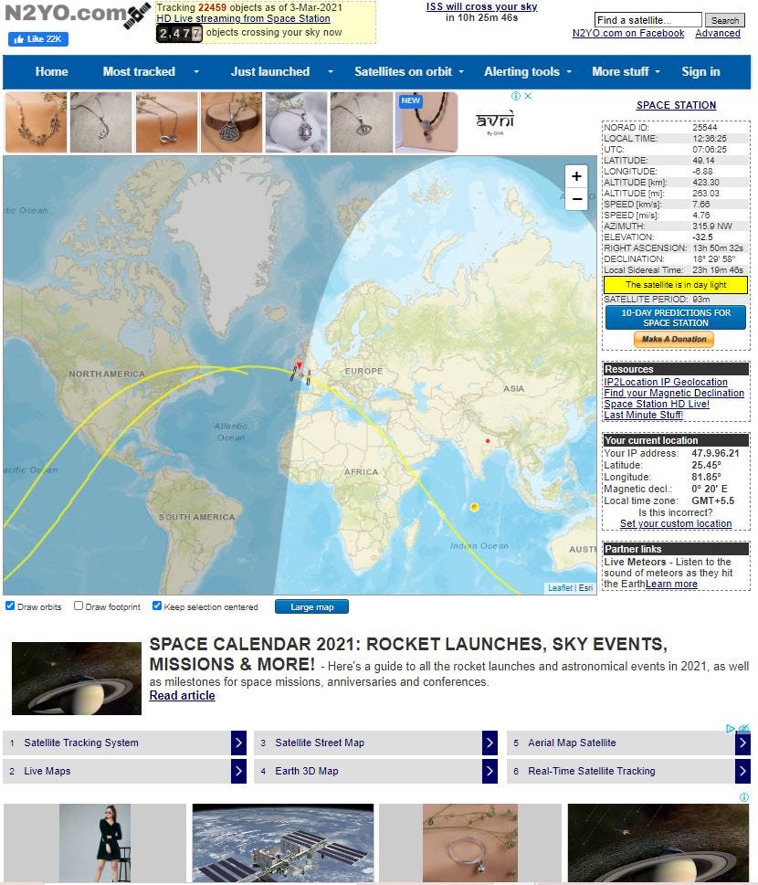
Problems with Old UI
There are many problems with old UI, some of them are as follows:
- Too much information in one go with no distinct clarification among categories
- Information sections are above page header
- Social media reach above page header
- Advertisements in center and top of page, before the map are pretty distracting
- There is no option to reset zoom in or zoom out of map
- Space station information is pretty congested
- It is a wrong assumption that every user wants to know his current location details, many companies picking up satellite data won’t regard this as an important information
- Page is flooded with advertisements
- CTA to get donation is less catchy to eyes
- The page is flooded with space news, seems like this is space news website rather than a monitoring one


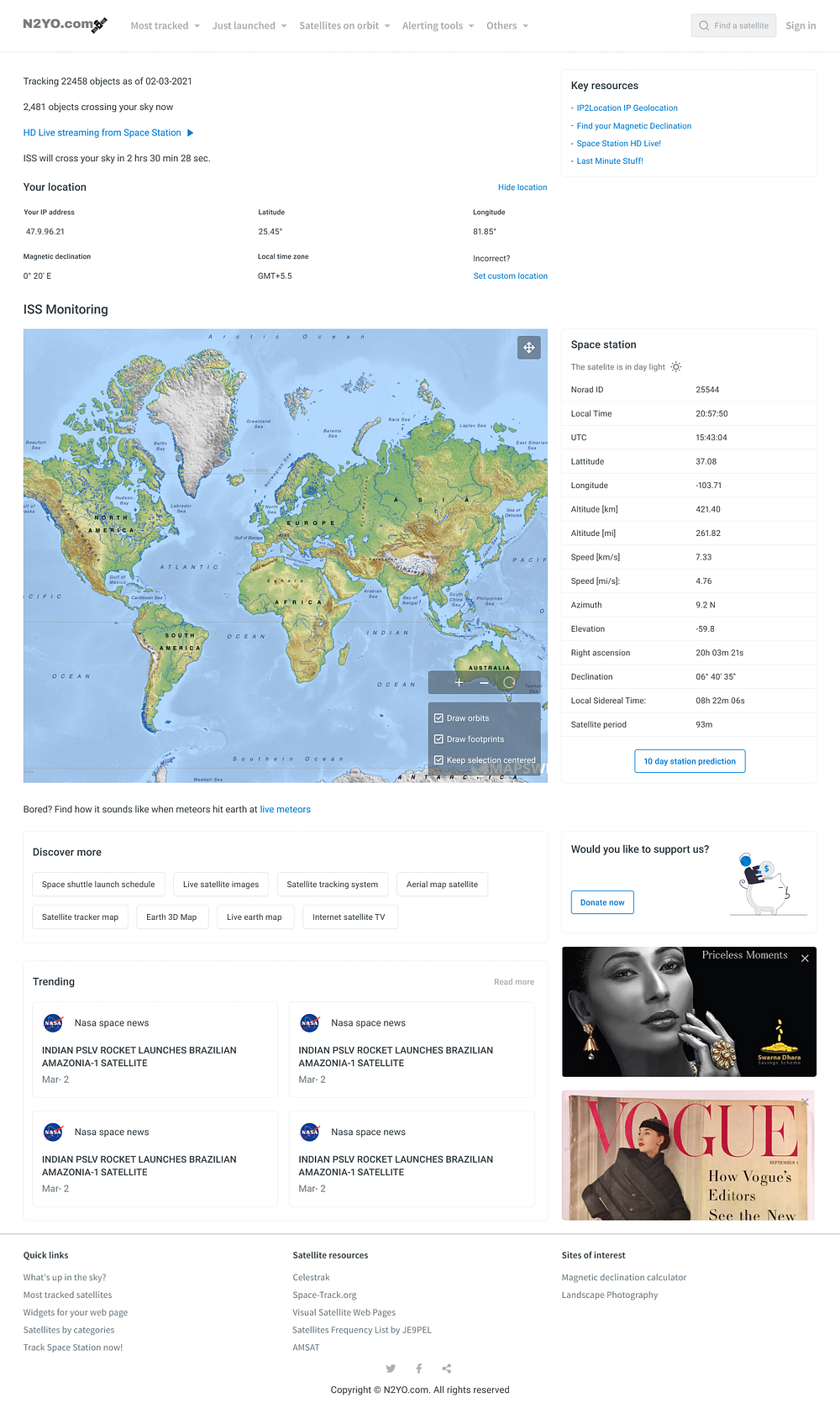
Solution
The problems with Old UI have been adhered to and worked upon and a cleaner flow has been designed.


Key improvements are as follows:
- Navbar has been worked upon, it is made clean more categorized with search bar
- All the active information has been shared in very beginning to capture user interest
- All resources have been shared in beginning to build trust and show authenticity of information
- Button is added to view current location, this adds onto interactive front of application and hides too much information in front view
- Satellite monitoring takes up major space of the page, this helps in directing user’s attention towards the main element of page
- Space station highlights are shown clearly
- Discover more section is added which redirects users to different website of N2YO.com, making users have an active participation in other products as well
- Donate now CTA has been highlighted
- Space news have been added as a section where top 4 are visible, if user is keen to discover more news they can find more
- Advertisements are important part of company revenue, so bottom right of page has been fixed for it. This way it doesn’t distract users.
- All quick links have been added as a footer, along with social media links.
Conclusion
A clean, smooth and effective design has been made to make information seem more fun and impacting. Reducing all major distractions now design is ready to cater the needs of users.
