KICKCASH — Mobile App Redesign
This project will have 3 subsections of redesign
- Home page redesign
- Wallet page redesign
- Stores page redesign
HOME PAGE
Key problems with home page are as follows:
- The header having hamburger menu, icon and logo with search bar is occupying too much additional space which isn’t needed
- The category carousel isn’t intuitive to show there are more than 4 categories, only when user scrolls/tries to scroll he will come to know there are more than 4 categories
- Top Stores + Cashback, this section has carousel which really doesn’t fit in. As there is already a See All option we need not show carousel to list all stores. Besides this the card for any store has no boundary or shadow to show it’s distinctive nature from the background, and the Offer is listed with previous offer, which is not a good way. Because there maybe a new cashback offer with no history
- Trending Offers, this section is most confusing because it lands user to have an endless scroll. There might be 40–50 or more offers and all are listed here.
In one line it can be stated is as, “ Way too much information in first view “
Solving all the above threats we get the following screen

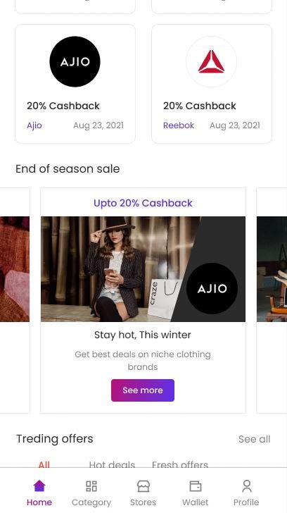
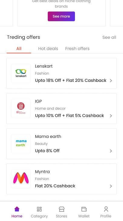
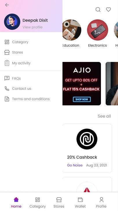
The additions made are as follows:
- The header is fixed, using minimal space for the navigation, search, favorite icon, along with the logo
- The carousel is fixed, now it’s pretty intuitive that there are more categories
- The Store card is fixed showing the clear deadline, offer and company.
- Trending offers is fixed with a “See All” button to allow user to see all offers and the number of displayed offers is restricted to 4. The cards for trending offers now has the current offer with category and company name
- A bottom navbar is added with main or most important navigation options
- The side navbar is refined (IA is refined)

WALLET
Key problems with wallet are as follows:
- The header occupies unnecessary space which can be used in a better manner
- The wallets shown don’t have a link to view all transactions
- Transaction list in ideal state shows how wallet works, which shouldn’t be there, rather the place will be occupied with some CTA that makes user interact with the app/make some payments
Solving all the above threats we get the following screen
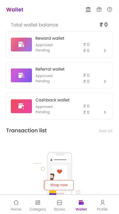
The additions done are as follows:
- Better header space utilization, which has transfer to bank and get a gift as icons
- The reward, referral, and cashback cards have been redesigned to match the color scheme of the application
- Transaction list graphic is changed with active shop now button
STORES
Key problems with stores are as follows:
- The cards used for stores don’t have information about the deadline
- There is no filter to find stores as per the category
- There is no filter to find stores as per coupon or cashback
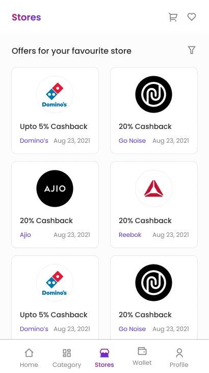

The additions done are as follows:
- Filters are added as per the category (i.e. Beauty, Education, Electronics, etc) and type (i.e. Cashback, Coupon)
- Cards for Stores have a clear boundary, have clear listing of Offer, Company and Expiry date
TO CONCLUDE
The Mobile App design has been revamped keeping effortless navigation and consistency throughout the app in mind. The bottom navbar is a great deal of addition which will allow quick and effortless navigation between important segments of app. Use of colors and typography has been done in a consistent manner.
Hope this experience makes you feel merrier.
