Designing Job Portal that makes finding jobs easy — Instant Jobs
Finding jobs is one of the most horrifying journeys that you have to take today if you are looking to start your career, or accelerate one. The pun of the situation is, this experience is bad not because there aren’t enough jobs but because there isn’t a decent way to find and apply for the jobs that suit you.
This project is all about understanding main pain points of the bad user experience, and making small amendments that will undoubtedly help for a great job finding journey.
TASK
To design a product to help people find and apply to jobs.
STRATEGY
The whole project is designed, following the below steps:
- Understanding the problem
- User Research
- Competitor research
- Persona preparation
- Making Low fidelity wire frames
- UI Designing
THE CHALLENGE
The ratio of unemployed people after COVID in India, is reasonably very high in comparison to the openings. Which adds on to the other challenges which are:
- Job hunting is a very tedious process due to lack of communication
- There is no timely update on status of application
- Many opportunities that are visible have no credibility
- There is no feedback, from the recruitment’s end once the profile is rejected
USER RESEARCH
The diverse group of users is classified into 2 groups, Active candidates who fall under 20–35 years of age. And Other candidates who are 35–50 age or above. The research was done by carrying on casual interviews, and understanding their perception. Questions asked during interview are as follows:
- How did you apply for the last job/current job? How long did it take from knowing about the opportunity to finally on-boarding the company?
- Which job portal app/site do you trust the most?
- What are your comments on the online recruitment process?
- What are your comments on the job hunting process?
and many more questions.

After interviews, a quick search on India’s most used job portals was done to get more insights about the current user experience. The main problems with these portals are as follows:
Many of the job postings don’t have a direct linkedin easy apply link, they redirect users to different websites which adds on to frustration of on-boarding several other portals.
Naukri, Indeed
Naukri and Indeed have poor UX, violating Jacob’s law and Doherty threshold they show too much data in first view. And Naukri has a lot of redundancy and spam when it comes to job postings.
USER PERSONA


HIGHLIGHTING MAIN PAIN POINTS
USER’S
- Job search results aren’t relevant
- Job application process isn’t convenient
- No feedback mechanism is frustrating
- Job description isn’t apt and clear
- Sometimes the openings are listed in portals, but they are no more open
- It’s hard to find the details about company
STAKEHOLDER’S
- It’s hard to access credibility of candidates
- Maximum of those who apply for job openings don’t fit to requirements
Stakeholders are added to the chain, because they are pretty important for the job application process
SOLUTION
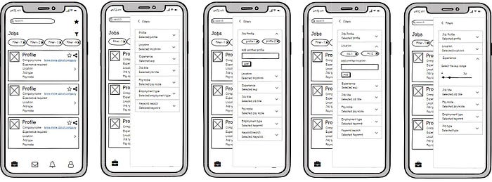
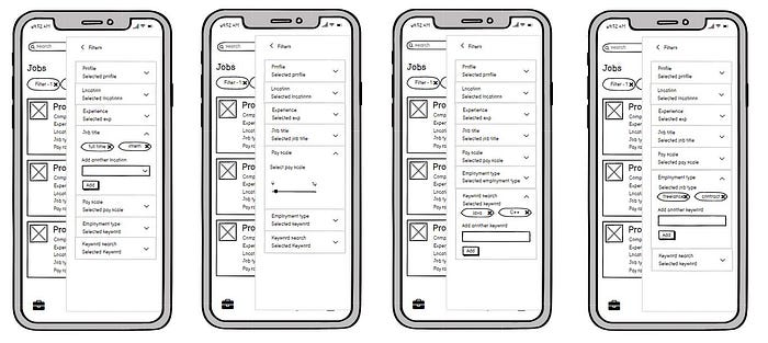
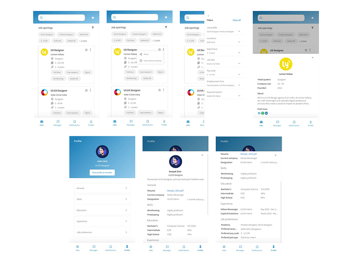
The main way to allow better search result is to make keyword based research available, where user can use multiple keywords while searching job as per preferences and the recruiter will add keywords to make the search flow easier, to make it work a minimum of 3 keywords have to be made compulsory while posting any job.
There are several filter options that can help streamline search besides keyword search option to facilitate easy and quick search as per requirements.
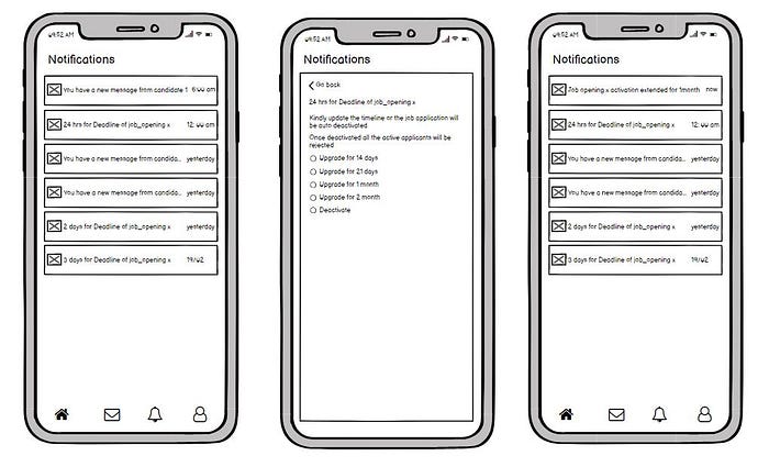
To make active feedback chain few features have been added, whenever a job is posted by the recruiter, the recruiter will be asked to provide the TTL (Time to live ) for which he wants job opening to stay active, the duration can vary from 14 days to 2 month period, after which job posting will be auto deactivated and all the applicants who haven’t heard from the company will be notified that the job posting has been deactivated. In case the recruiter doesn’t find a potential candidate they can extend the period for another duration (which extends from 14 days to 2 months), recruiters will get notification from 3 days beforehand to extend the duration of job posting if they want to. They can always deactivate a job posting so that it is not visible anymore.
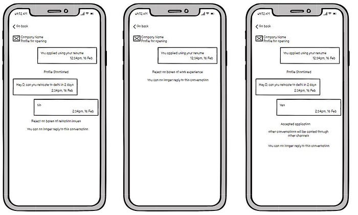
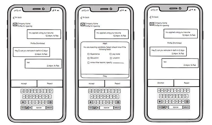
The second change that is added to make the active feedback chain alive, is a quick rejection form that has to be filled by the recruiter once they reject a candidate. To make it a quick and easy step, there’s a prebuilt form with a checklist of default set of possible rejection reasons and an input field if there are any additional comments, the recruiter can select one of the checklist as per the candidate’s profile, and share across the generated feedback. To maintain fluidity there is an option for additional comments.
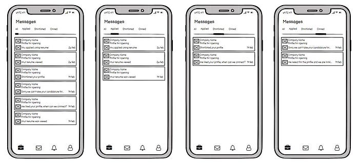
Messages have been divided into three categories: Applied, Shortlisted and Closed. The communications for a job application are categorised under the “Applied’’ category. Once the candidate is shortlisted for an opportunity, the message moves into the “Shortlisted” tab. Going forward, all the communications for the shortlisted job post will be posted under this category. Lastly, once the users profile is either shortlisted or rejected, the communications will move into the “Closed” tab. When a profile is moved in the closed category, the user will receive a mandatory feedback from the recruiter to help the user understand their shortcomings and work on them. Any further communications will be carried through the formal channels of the company or any other means that the recruiter and the user agree upon.
To help users know and understand more about the company and its credibility, basic information about the company will be collected by recruiters along with the website, linkedin and glassdoor links.
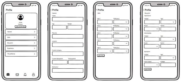
To help users see what recruiters see in their profile, there is a “view as recruiter” button, which can help users work on their profile.
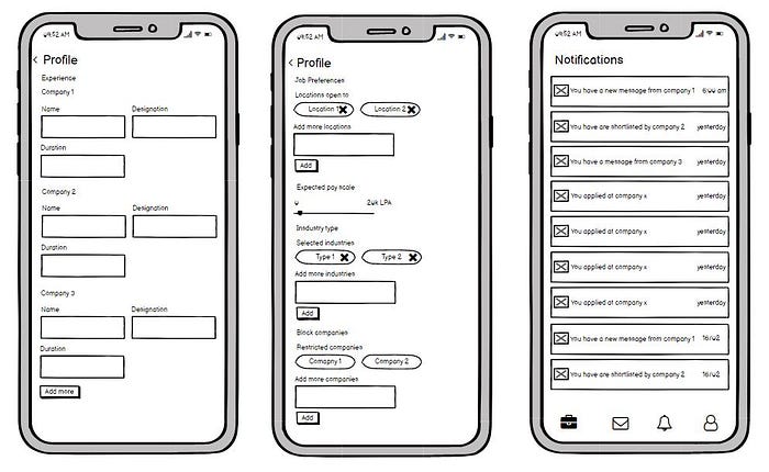
Like other applications this will also have a block company option in case the user wants to hide that he is looking for opportunities.
WIREFRAMES
FINAL DESIGN
CONCLUSION
“ People ignore designs that ignore people. ”
With this belief product has been designed, that eliminates major frustration points, and allows users to have a satisfying and happy job searching experience.
